This spring, the Saskatchewan Publishers Group's "..of the month" content has a common theme of publishers and people who "do it themselves". Parkland Publishing evolved from Robin and Arlene Karpan's nature photography business into a self-publishing success story. Kim Morrissey has parlayed her beginnings as a humble Saskatchewan writer into an international reputation. The Saskatchewan Indian Cultural Centre has met the challenge of short press runs by developing their publishing program based on in-house "publishing-on-demand" technology instead of the traditional print run technique.
With these "do it yourselfers" in mind, I thought I would discuss some tips that I, as a self-taught HTML designer, have found applicable for every site I've designed and why I wish more sites on the web would follow these ten simple principles.
(See Salonmagazine.com for a great example of good formatting of text on the web.)
Geocities takes a lot of criticism (valid in my view) for their innovative technological features - a stylized "G" watermark that appears transparently on the bottom of every page on their system (and moves down as you scroll through a page) as well as pop-up advertising windows that appear as soon as you visit any Geocities page.
I'm a self-taught "do it yourselfer" so I realise that these "laws" are really only guidelines. So any corrections, suggestions or comments would be welcome. E-mail me at jason_hammond@hotmail.com.
TEN LAWS OF HTML DESIGN
(AND REASONS WHY THEY'RE LAWS)
- If you have your full address, phone number, fax, e-mail address, and especially your URL on your home page, people will always know how to reach you. "The URL is right there in the location window - why do we have to put it on the home page too?" you might ask. Well, what if your site pops up in some other site's frame? Then it's their URL, not yours, that's shown and not everybody knows the tricks (hint: right click in the frame and select "open frame in new window") to find out the URL of the embedded page.
- Not everyone comes directly to your home page. Because of search engines that archive your entire site, visitors can arrive at any level in the hierarchy of your site. Giving visitors an opportunity to get back to your home page allows them to figure out who YOU are. This is especially important for anyone who needs to find out who is responsible for the information they're reading - everyone from students researching papers to people researching health concerns and so on. If you find a page listing "Best Books of the Year" but if you can't get back to the main New York Public Library page (this is a hypothetical example), how will somebody know who compiled this information? How reliable it is? What bias the page might have?
- Centuries of book making can't be wrong, the best way to read information is black on white. Sure, it's nice to take advantage of all the fancy colours available but do you think your visitors' eyes might get just a little tired if your site is made up of hot pink text on a jet black background? In a related note, don't use background images at all and if possible, raise the size of the text for any section that's of significant length.
- Java, Javascript, Shockwave, animated graphics are all "neat" features for your web site but once the "gee whiz" factor wears off, are your visitors just going to be bored? Or worse, are they going to be angry? How many web sites have you been to where the Java coding is bad and you have to click through an endless stream of "Java Error" boxes to get to the site?
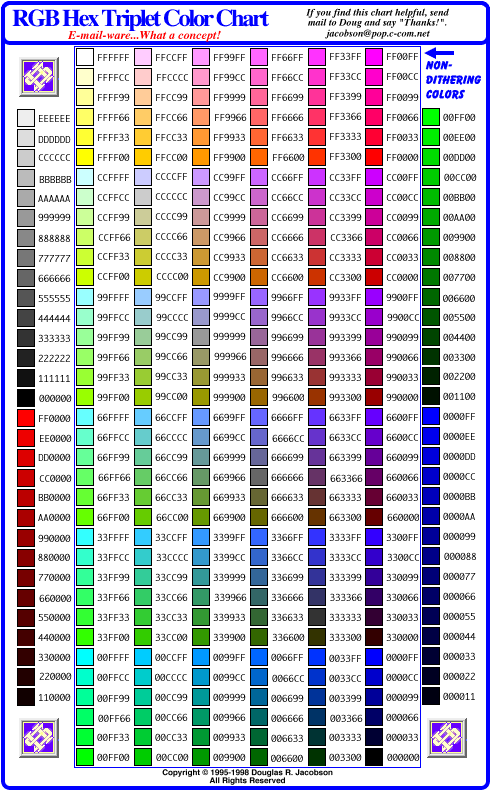
- The six digit hexidecimal codes used to define your TEXT, LINK, BACKGROUND and VISITED LINKS are based on a six digit formula "RRGGBB" where RR = red value, GG = green value, and BB = blue value. The higher the number, the "more" of a colour you add. "000000" is black (no colour added), "FFFFFF" is white (full values of each colour).
Here is a chart of browser safe colours courtesy of Douglas Jacobson, an American web designer.
- Always use WIDTH and HEIGHT tags to make a page load faster. Always use ALT to describe your image for people with their images turned off. Always use text instead of images of text where possible. (Does your company logo really need to be a 30k graphic image?)
- Use META tags in the HEAD of your page. Put a description of your page at the top of the page so search engines will have something to put in their blurb about you. Submit to search engines. Actively seek out reciprocal links with similar sites and more importantly, sites that may not appear to be similar.
- Sure, the latest IBM-PC versions of Netscape and Explorer dominate the market but there is still a large chunk of your audience that might be using old versions of these browsers, alternate browsers, text-only browsers, Macintosh or Unix systems. Also, try to check your site on the oldest, most basic machine possible. Currently I use a Pentium 166 with a 33.6 modem, 16 MB Ram and a 14" screen at 640 x 480 screen resolution. If the site I'm working on doesn't look good, load quickly, and work properly on this machine, I scrap it and start over.
- It's not page layout. It's not download speed. It's not multimedia options. It's not number of hits. In the end, what really makes a good site is CONTENT. I'll say it again, it's so important. CONTENT. Think of your favourite sites - Salonmagazine.com, Newsworld.cbc.ca, Yahoo, Hotmail. All are united by the fact that visiting them gives you more information when you leave than you had before visiting. Changing CONTENT is even more important. Whether it's Salon posting daily stories, Yahoo adding new links or Hotmail giving you more e-mail daily, all these sites have content that is constantly changing for you.
- Hits are considered to be every time a single page PLUS all the graphics on that page are loaded. Graphics intensive sites can bloat your hit counts. More standard are "page impressions" - the number of unique visitors that load individual pages on your site. These can be misleading too. Sure, you can quadruple your number of page impressions by hiding the words "Free Naked Celebrity Pics" in your Meta Tags. But would you rather get 5000 misled visitors each month or 1000 people who found your site because they thought it had the good content and information they were looking for?
Jason Hammond
Marketing & Technology Officer
Saskatchewan Publishers Group
#100 2505 11th Avenue
Regina, Saskatchewan
Canada S4P 0K6
Phone: (306) 780-9808
Fax: (306) 780-9810
Back To Head Tale's Home Page